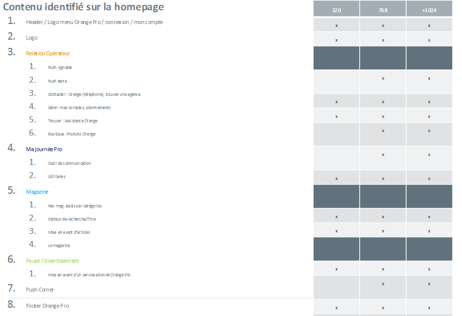
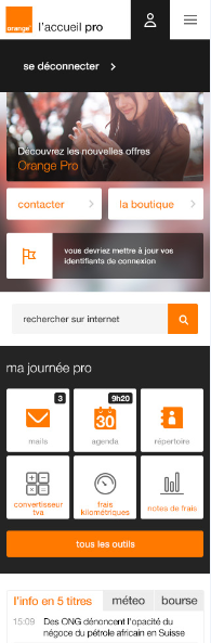
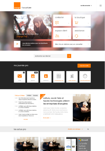
Summary document after the workshop to list and prioritize elements, here we can see the main page of the website
A French network provider’s company asked us to re-shape a portal. They wanted to use responsive web design, because they need to evolve and deploy their services simultaneously. Our role was to codesign the portal and to develop the front end layer. Because I have some experience with building websites, I know there could be pitfalls with a big company trying to build a RWD website with a top down approach. When they are dealing with technical constraints of this kind, it could slow down the project, and could turn out to be costly with a lot of loops.
Team : Ux designer (me), project manager, visual designer, front end developer.
Goals of the first workshop were to introduce the methodology, and framing business needs. At this point we figured that we had to cut most of the content, re-organise it and put it in a new portal.
Because of the complexity of RWD, we needed a design process that engages and involves the stakeholder. And also to allow the content to lead the process before the visual design. So the customer could understand what we are doing and where we are heading. Prior to the workshop we prepared pen and paper design material, with a nice example of the work to perform. The main goal at this step was to select and prioritise content for each page and for each major breakpoint (resolution). So we began by asking the customer to prioritise content from the more important to the less important from the user perspective. We started with the most used page of the site, then we proceeded the same way for other pages. This process helped the customer to think about the different tasks for the different user types.
Using paper lists at this point was a great help to focus on content only. With this material we could easily collaborate with the customer one step at a time.
The next step was to fit the content into space. Co-design helps significantly with having meaningful project discussion. It is why we managed to involve the customer in the process of drawing zoning (based on the data we produced together). This is when the most important and meaningful discussions could happen.

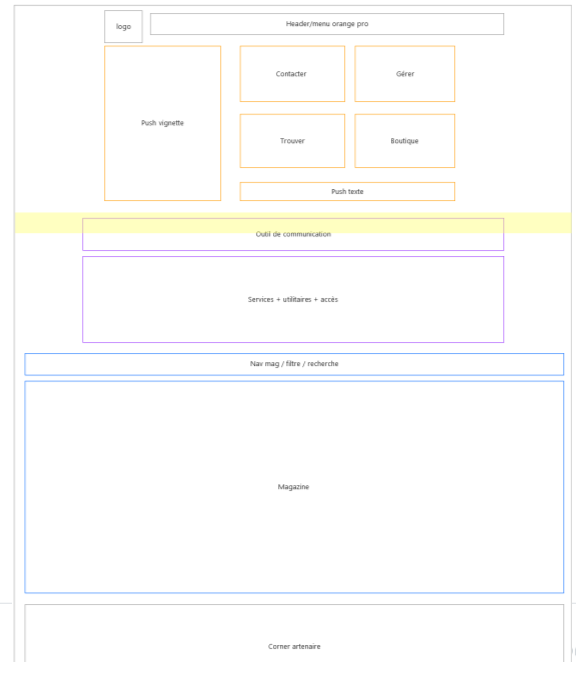
After that I spent time re-organizing content, making IA documentation and completing the low details wireframes.
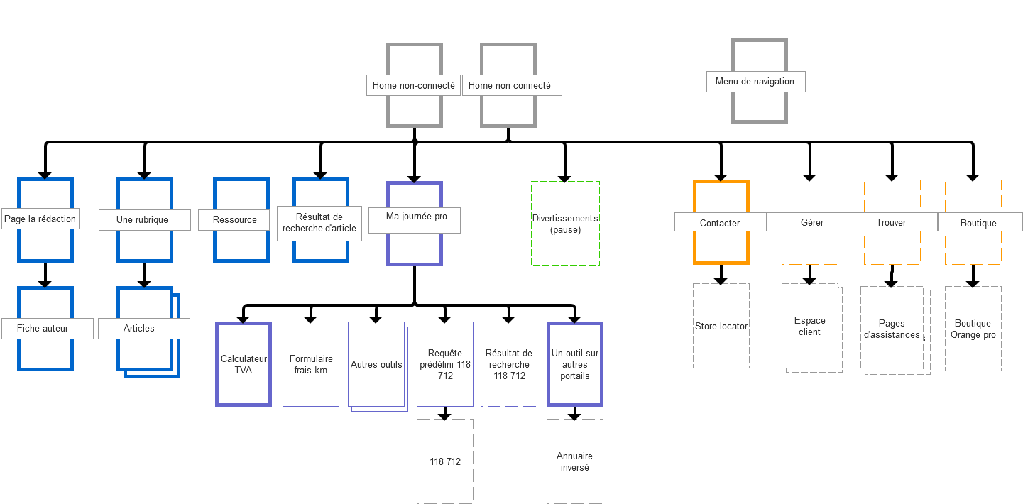
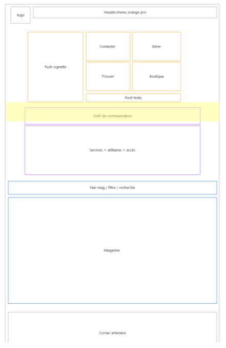
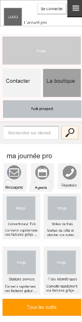
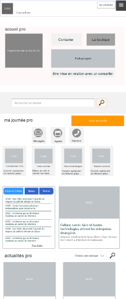
Next, high level wireframing was needed to polish the navigation system and to have a strong basis for the visual designer. It is also mandatory with waterfall process to gather information in a proper way for front end development. We used a complete dynamic wireframe for the 3 main resolutions and we annotated it to cover all interface specifications.
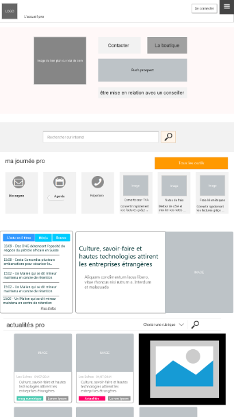
Extract from the Axure global wireframes (main page)
We did not encounter any pitfalls at this stage of the project. Because we collaborated closely from the beginning with the engineer about the feasibility of what we proposed and the fact that we covered all the angles with the methodology we deployed.
In big organisation RWD projects are challenging, because the habit to drive design from the top down interferes with numerous technical aspects. So we thought that really involving the customer is useful in this situation.
On the other hand the process we deployed was mostly content-centric but it let us handle the project with more surety and speed. For a following project I want to improve the process on the creative side, one way could be to involve the visual designer earlier in the process.
A company specialising in network security asked us to design a mobile application for mobile payment in stores. The goal was to create a prototype for a new user experience, where the wallet was closely connected to the store in which you want to buy .
One important point was they already had worked on a previous app that was a failure, so they wanted a new well designed app. The main problem was they had no real experience with the design process, the team was overly focused on the new features they wanted to add, as well as the visual aspects of design.
Team : project manager, ux designer, visual designer
We first organised a workshop focusing on the user flow. The goal of the meeting was a reality check of the provided scenarios. We discussed each situation of how the customer could use the product.
“What are their needs in this situation ?” “How they would they use a feature in such a situation”. We used a diagram to visualise each flow, and we drew a quick interface with pen & paper. We asked the customer to try to figure how the user will go through each step.
As a result we simplified the flow for each scenario and we had a strong agreement to go further.
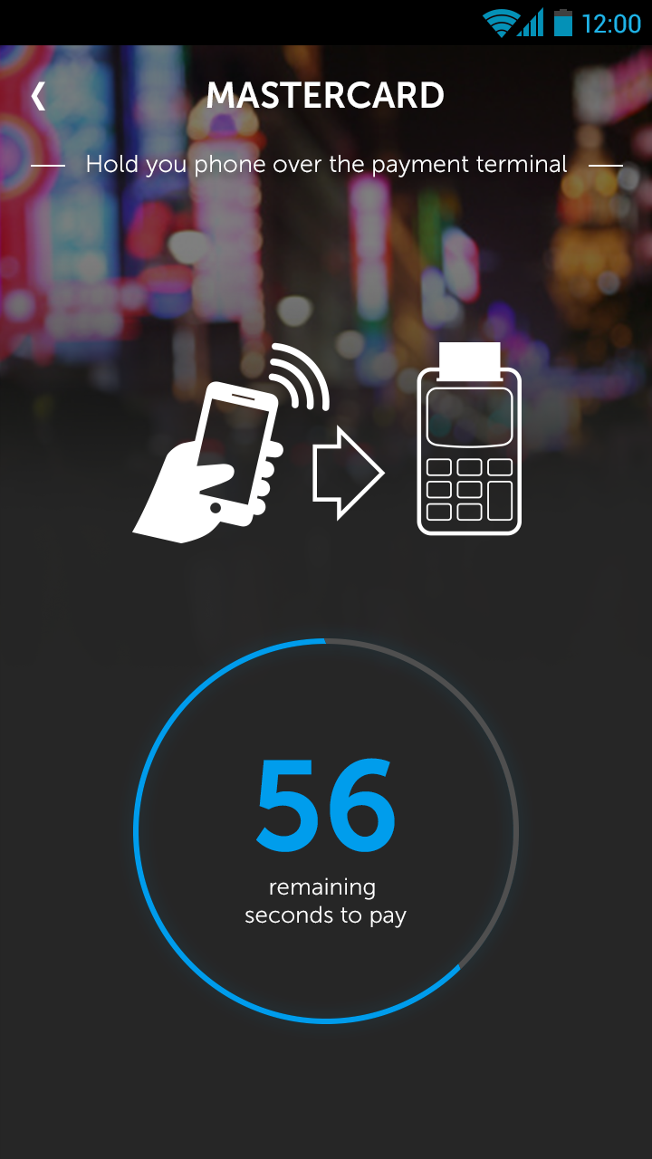
The major design issue was to design an understandable mobile app flexible for different ways of payment (NFC, QR code, pure internet) in the store or at home. With discount voucher for in store situation. And of course the application’s principal goal was to be quick to use and easy to learn.

We continued our work based on pen & paper wireframes, it allowed us to quickly try different leads, we also involved the customer with a workshop to present the different concepts.

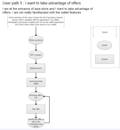
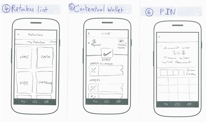
Here is one of the last drafts on which we agreed with the customer. The user can access the credit card selector at the top of the home screen, QR code payment could be accessed on the left side, and NFC payment is accessible at every-moment.
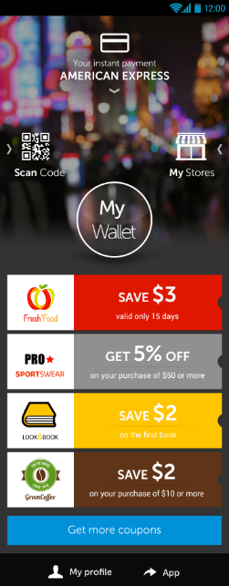

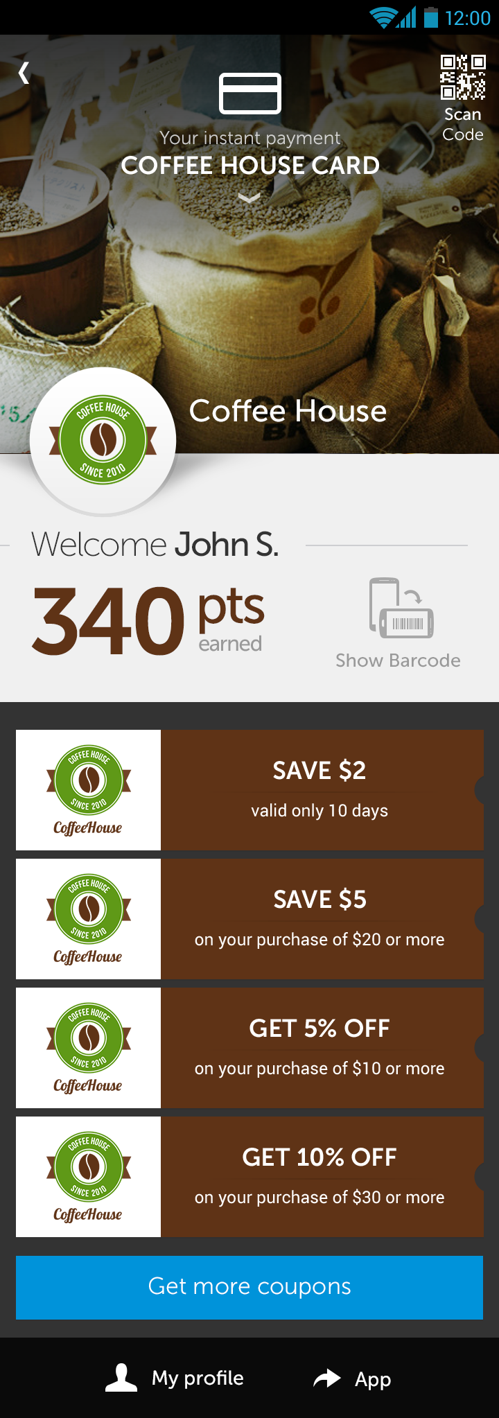
The final concept “the contextual wallet” : the user “taps” the smartphone to a NFC tag at the entrance or inside a store. The layout of the home screen changes and becomes contextual to the store experience (means of payment and discount offers).
Even if the project was a success from the point of view of customer satisfaction, we knew that we should run some user tests to check the concept validity and to improve it. Unfortunately we could not convince the customer.
Moreover, we did not figure how to showcase important animations inside the app (cards selector). At this time we did not know about such tools as Pixate, which allow to simulate accurate animations.
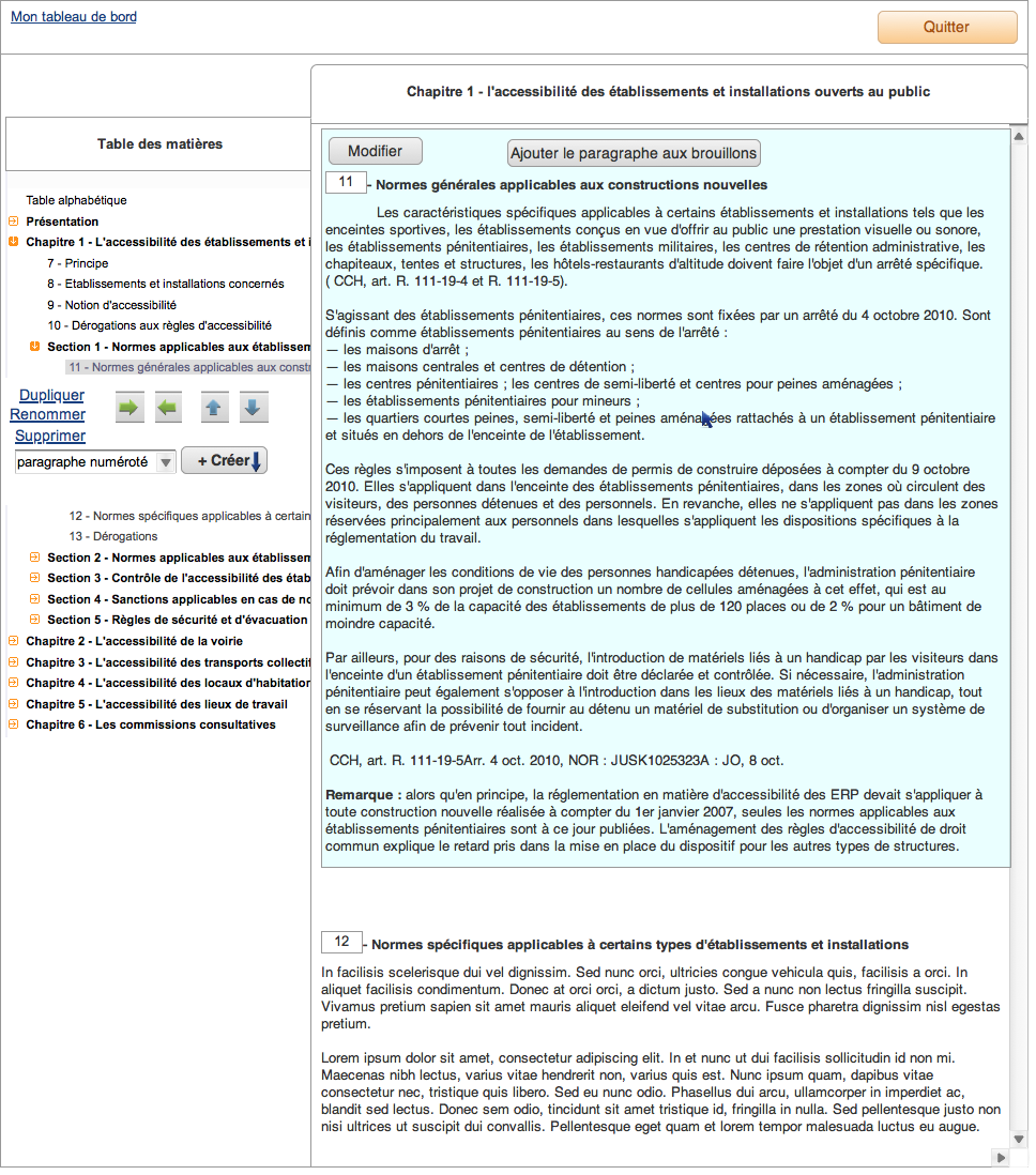
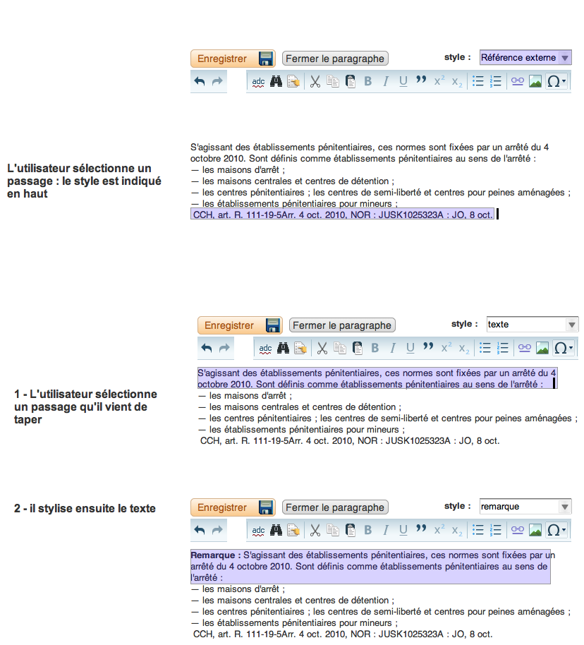
Our agency was contacted by a publisher company specializing in law books. Numerous lawyers update law books by sending MS word documents by e-mail. Because the final type of document is XML, the company wanted to build software to enable the lawyers to write directly to the final XML document.
The main problem was that XML styling is a complicated concept for users not highly skilled in computers.
Team : Ux designer (me), project manager
After the brief was received, we managed to convince the customer that the project can only be efficient if we put real users “in the loop”. We conducted interviews to understand how they work and their degree of mastering of computing tools.
We chose to break the main task into a sequence of small tasks, because designing software requires to be accurate in each interface behaviour. We explained to the customer each micro task, so we could receive immediate feedback. It was easier to process for this kind of project.
We decided to make the experience as close as possible to the software the users already uses. It means we had to make XML structure invisible, restrict freedom in certain cases, and to allow users to recover from error later in other cases.
At the same time we discussed each step with the front-end and back-end engineer working on the framework integration.